 |
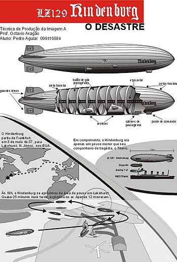
| Infographic Hindenburg (Photo credit: Wikipedia) |
His introduction states
"The more I visualise data, information and knowledge, the more I'm starting to feel and understand the difference between them... understanding really is the key'.
I was excited by this statement, as I'm always advocating differentiation between information and knowledge (terms that are often used interchangeably). Infographics that simply convey meaning in an attractive way can be very powerful. I always remember the excellent exercise that Lulu Pinney did for KIN - we were asked to determine the essence of the infographic's 'story' with the captions hidden. This is a simple test that I find most newspaper infographics fail miserably.
In looking at the reviews of 'Knowledge is Beautiful' it seems that complexity is creeping in. It also seems that the promise of McCandless' introduction is not really delivered in his graphic examples; if knowledge is about know-how and expertise the book still conflates this with information.
I'm hoping that another book that combines two of my interests (graphic design and London) London: The Information Capital finds it's way into my Christmas stocking (hint, hint!).
This will be the last KIN post of 2014. On behalf of all the KIN team, we would like to wish you a Happy Christmas and prosperous 2015.


.JPG)
